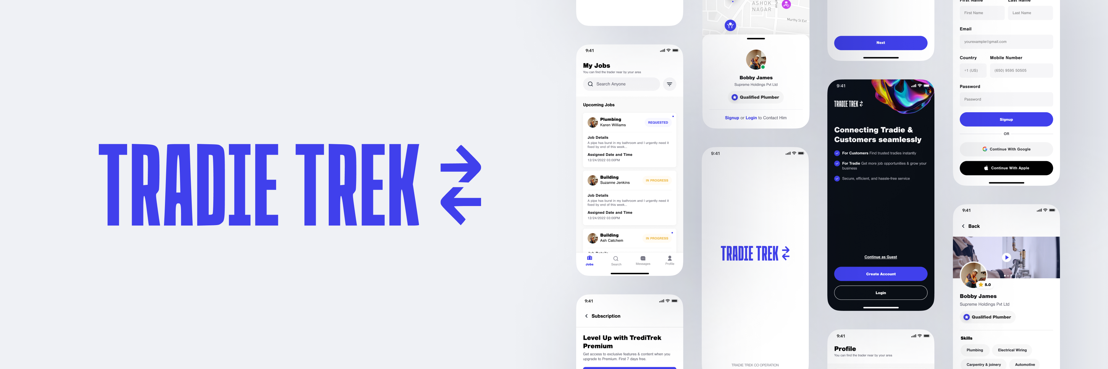
02 / PROBLEMThe core challenge was turning a fragmented product and brand experience into something clear, usable, and cohesive.
Tradie Trek had useful product value, but the overall experience felt split across separate touchpoints. The strength of individual screens was not translating into one strong product story.
The design problem was to reduce confusion, create a clearer structure, and make the product feel like one connected experience instead of disconnected parts.
03 / USERSThe experience was shaped for busy users who needed clarity, speed, and confidence while moving through the product.
Research focused on stakeholder conversations, user and partner interviews, and competitive review. That work helped identify what users needed most: a simpler journey, clearer actions, and a more intuitive structure.
The audience included people interacting with the product regularly and needing to understand information quickly without friction.
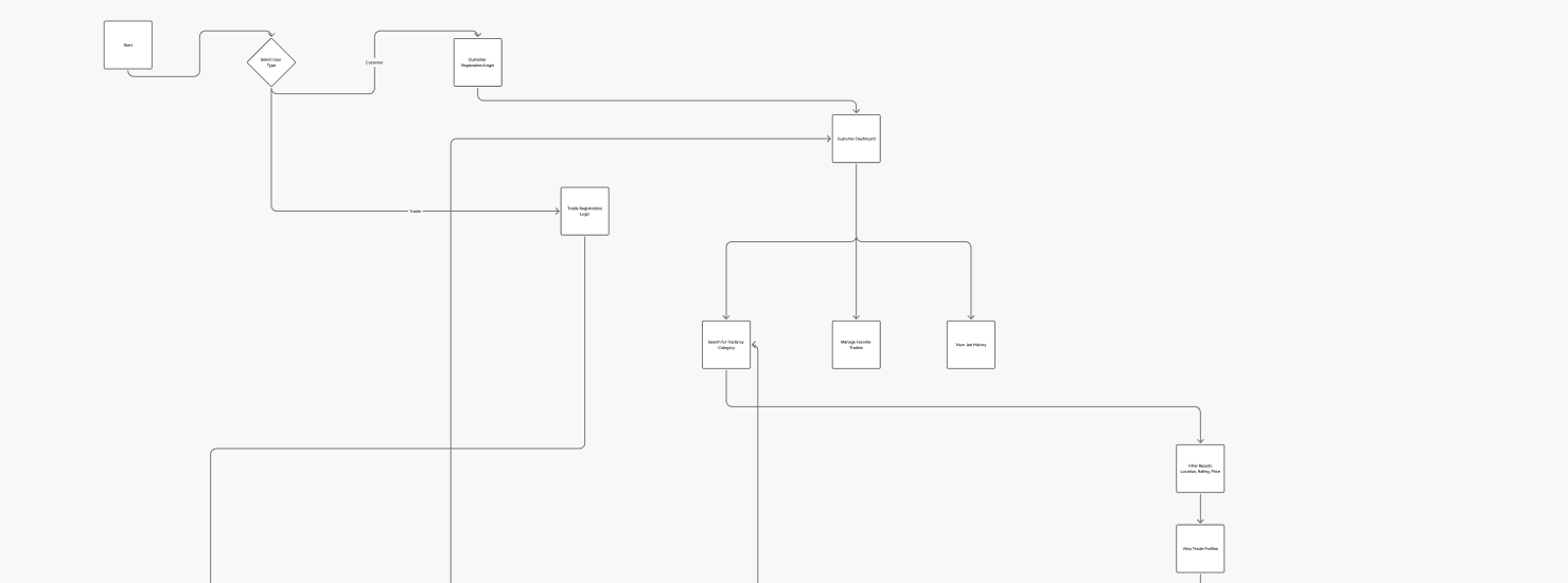
04 / SOLUTIONI designed a clearer mobile product direction that unified the experience and made the interface easier to understand.
The solution focused on creating one stronger visual and structural system across the product. This meant sharper hierarchy, a more deliberate navigation flow, and a more consistent brand expression.
The design language was built to feel flexible and scalable while still keeping the product simple and user-centered.
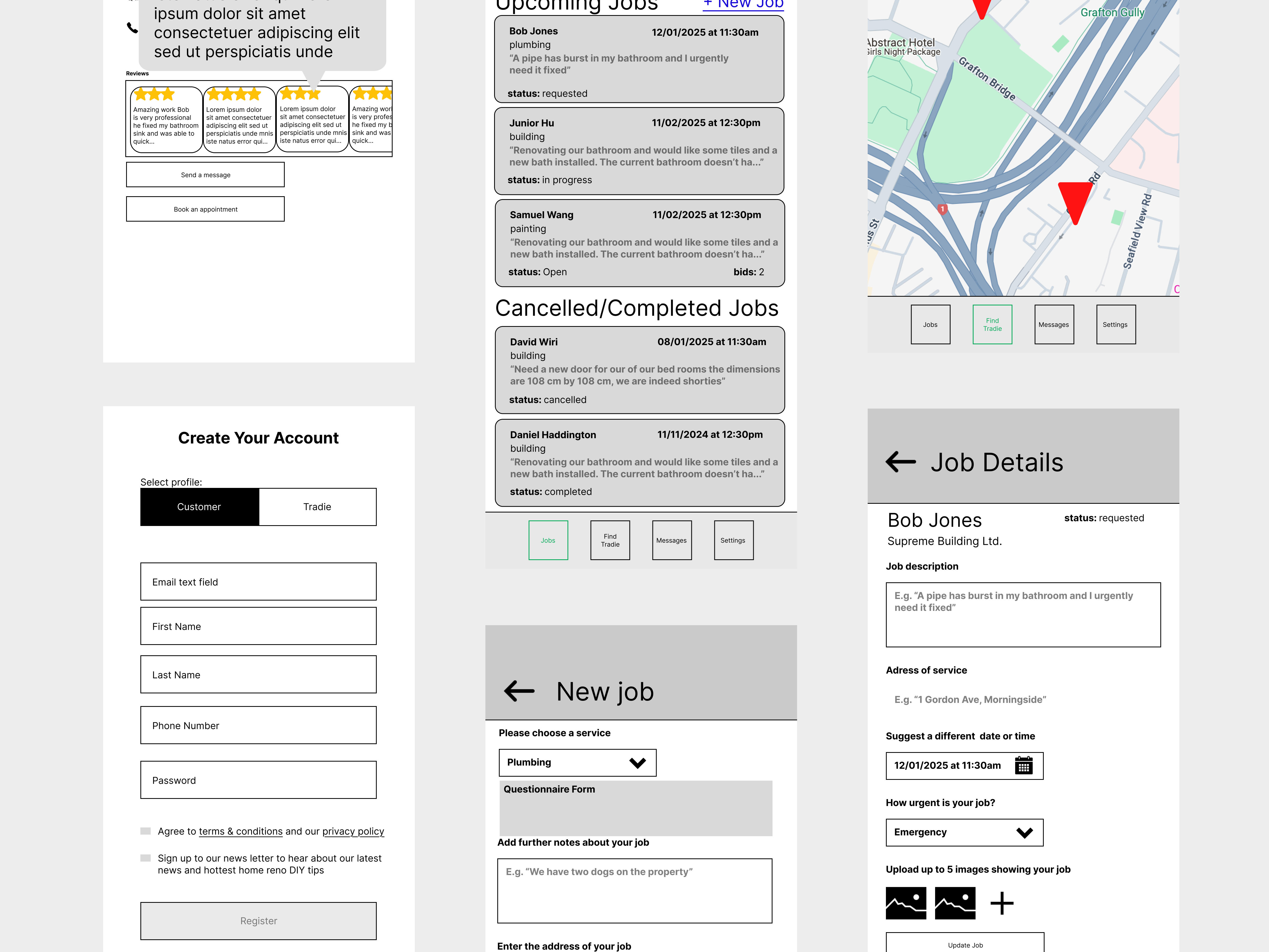
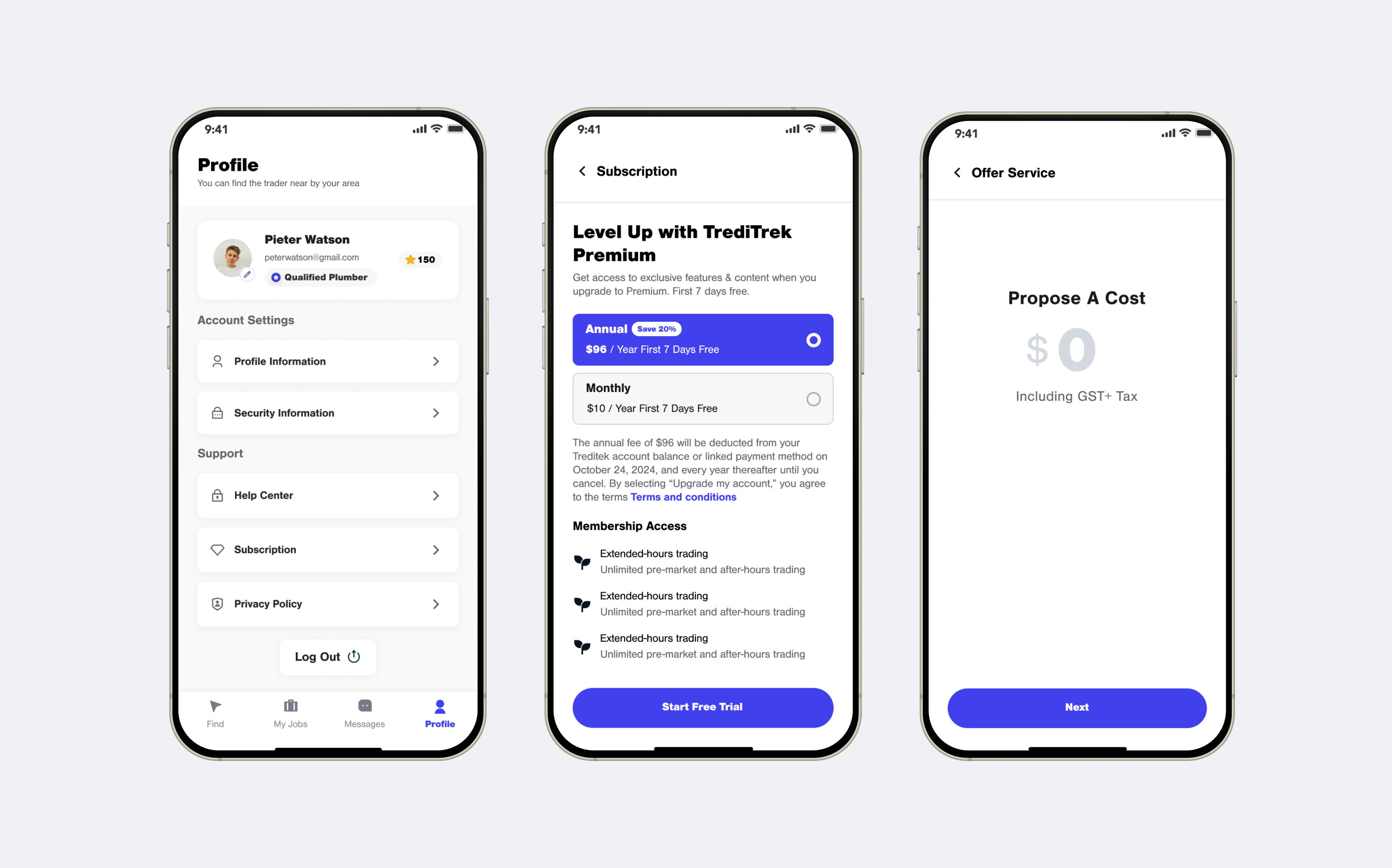
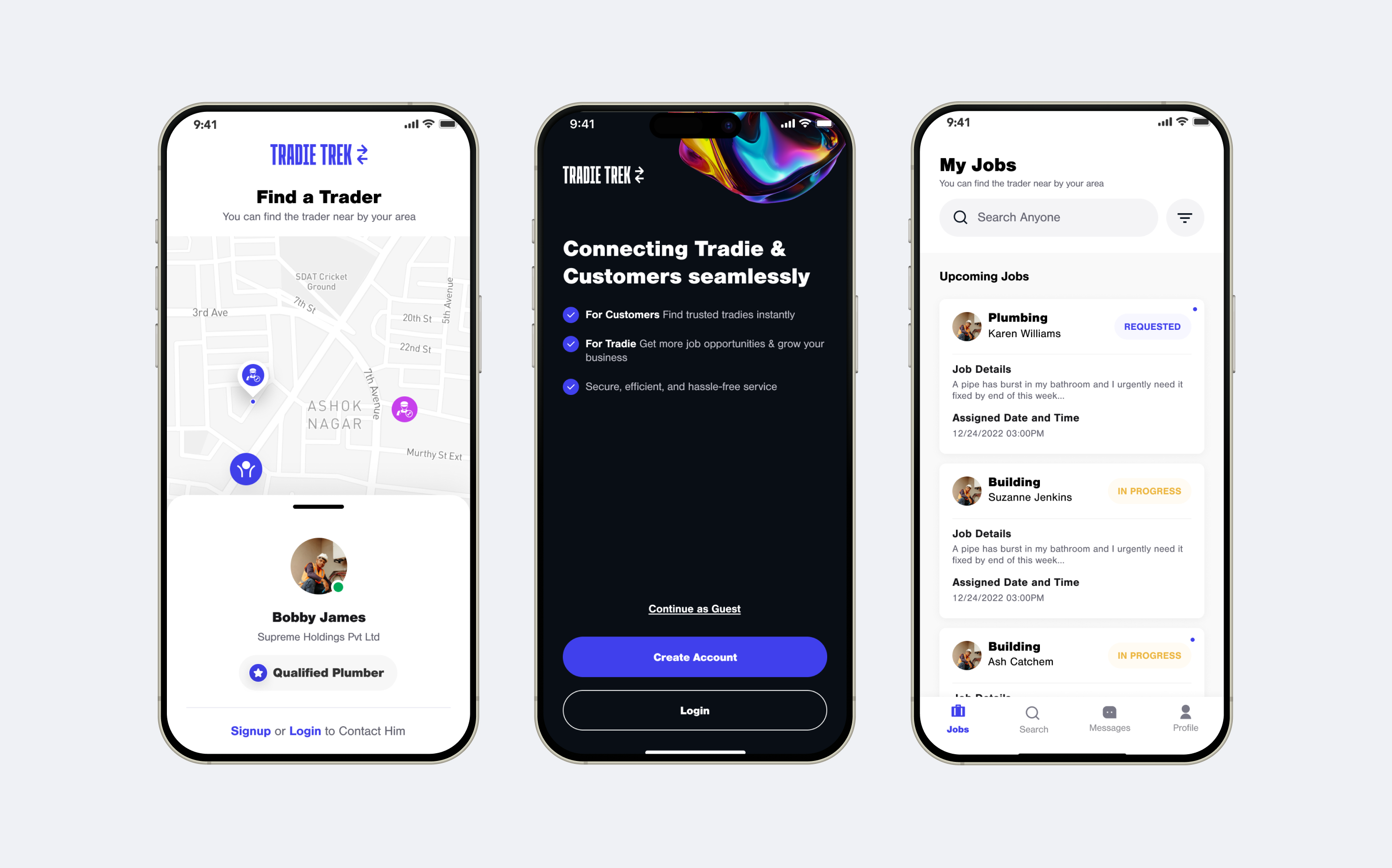
06 / FINAL UIThe final UI system brought the product into a more refined, modern, and consistent visual experience.
The final screens focused on clean hierarchy, clearer content framing, and a stronger mobile-first presentation. The result is a UI system that feels more intentional and easier to navigate.