KAVEESHA CHAVEED
[02]

JUNGLE

Connect. Discover. Book. Revolutionising how travellers find and experience the world.

[Scroll to Explore]

Mobile AppUI DesignBrand IdentityAnimationsUX Research
Jungle hero showcase
01 / PROJECT OVERVIEW

Jungle is a mobile travel product concept designed to make discovering and booking local experiences feel more curated, emotional, and intuitive.

PROJECTJungle
WHAT IT ISA travel and experiences marketplace focused on helping users discover unique stays, activities, and local moments through a more immersive product experience.
MY ROLEProduct Designer across product thinking, experience direction, UX structure, visual design, and interface refinement.
PLATFORMMobile-first product concept
FOCUSDiscovery, trust, and booking clarity
SCOPEBrand feel, UX flows, and polished UI screens
Jungle mobile visual one
Jungle mobile visual two
02 / PROBLEM

Travel products often make discovery feel transactional, overwhelming users with listings before they build trust or excitement.

Jungle needed a more emotional and guided journey. The challenge was to create a product that still helped users compare, decide, and book efficiently, but without losing the sense of exploration that makes travel compelling.

The product also had to support providers by presenting their experiences with more personality, better visual storytelling, and a clearer path to conversion.

Jungle brand identity overview
03 / USERS

The experience was designed for travellers seeking more curated experiences, and for hosts who needed their offerings to feel trustworthy and distinct.

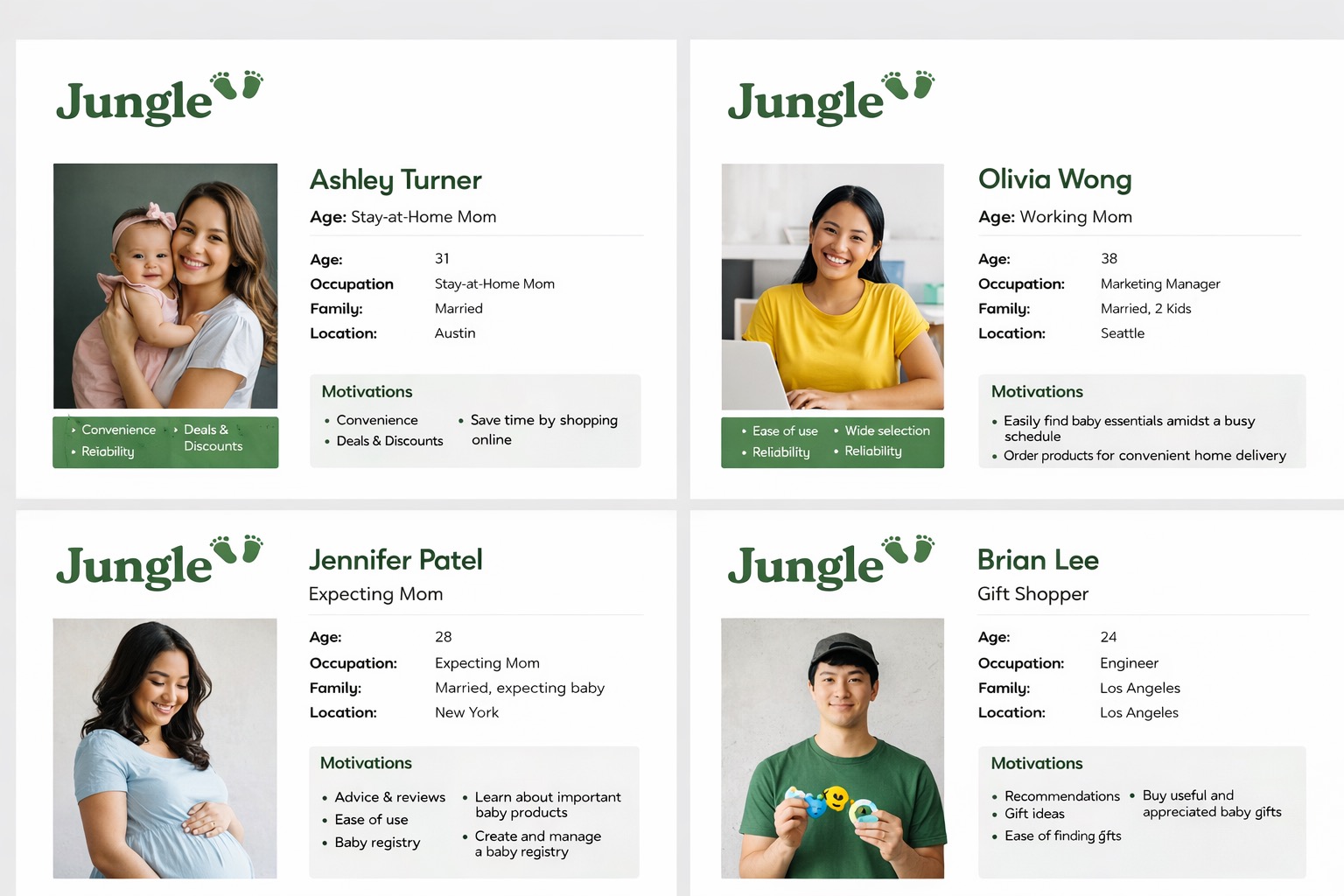
On the traveller side, the product needed to reduce browsing fatigue and help people move from inspiration to decision more confidently. On the provider side, it needed to communicate value quickly and create a stronger first impression.

Jungle user personas
04 / SOLUTION

The solution was a visually richer mobile experience that balances inspiration with usability across the full browse-to-book journey.

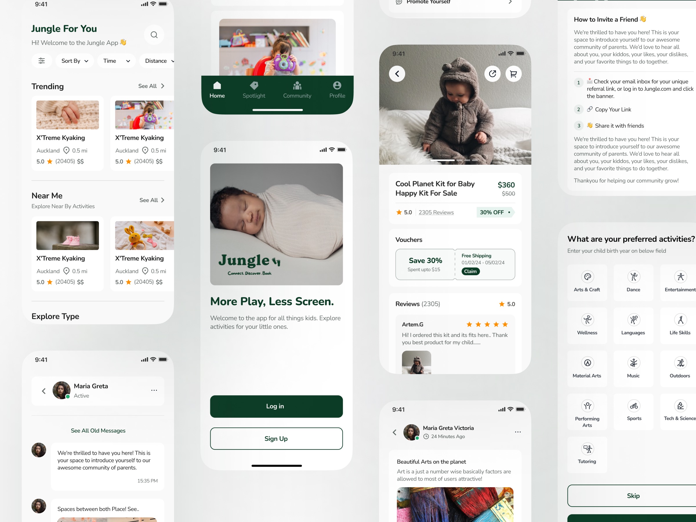
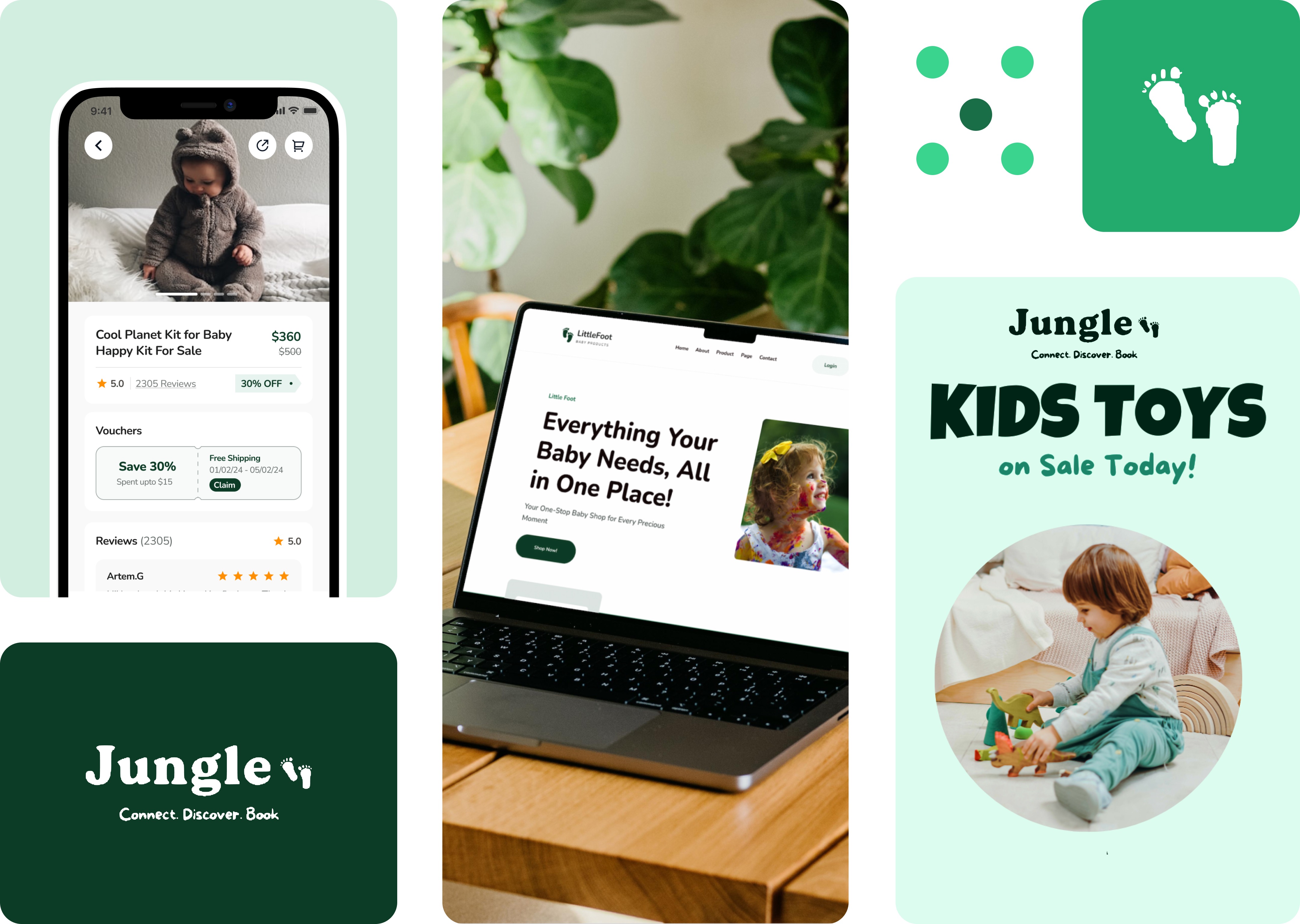
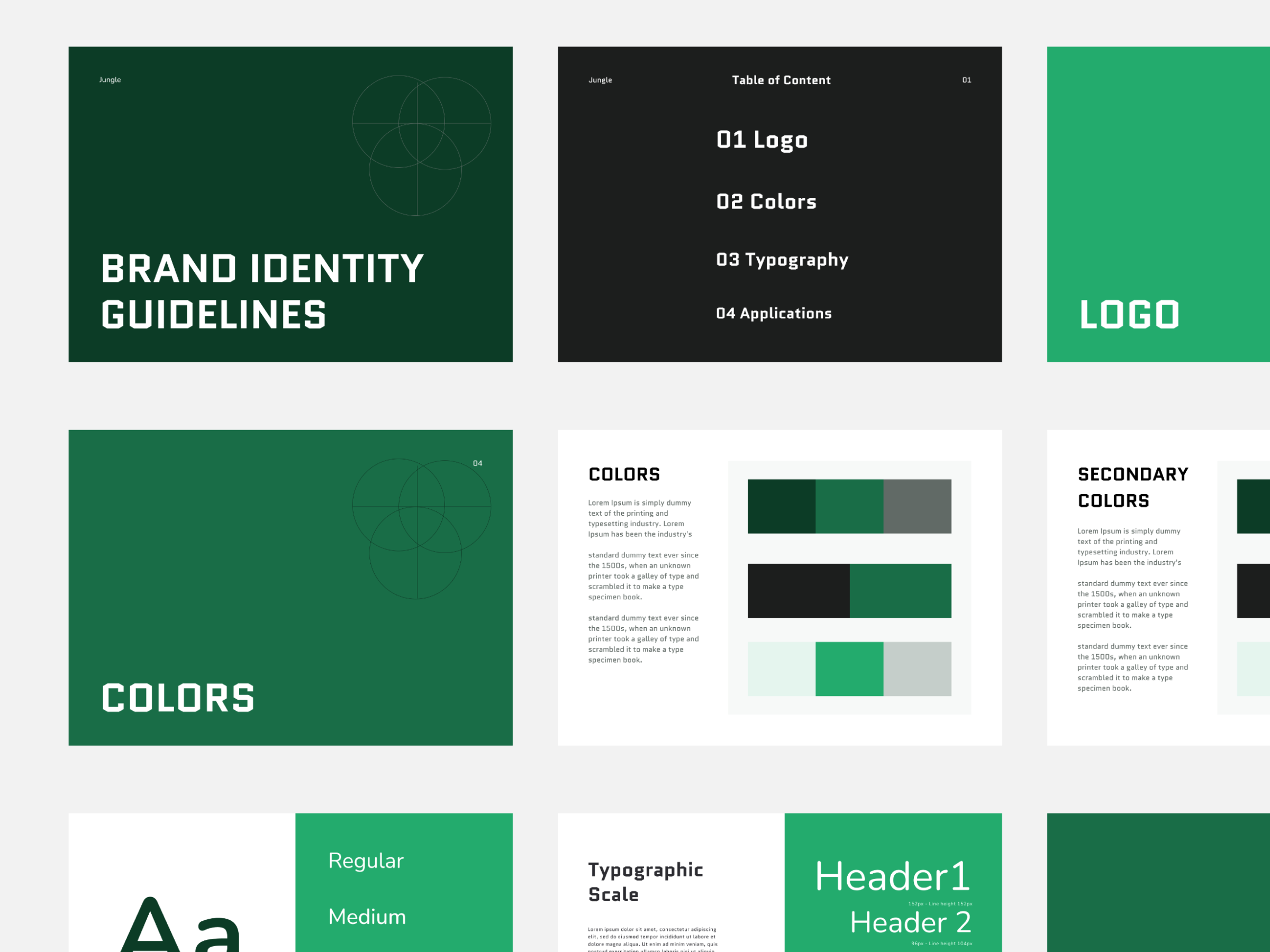
I focused on stronger imagery, cleaner hierarchy, more deliberate content framing, and a calmer booking flow. Each screen was designed to make the product feel premium while still keeping decisions easy to make.

This created a product language that feels more editorial and immersive than a standard booking interface, while still staying practical for real product use.

Jungle logo and brand solution visual
Jungle solution visual
05 / PROCESS

The process focused on shaping a more intuitive discovery flow, refining the content hierarchy, and giving the product a stronger visual rhythm.

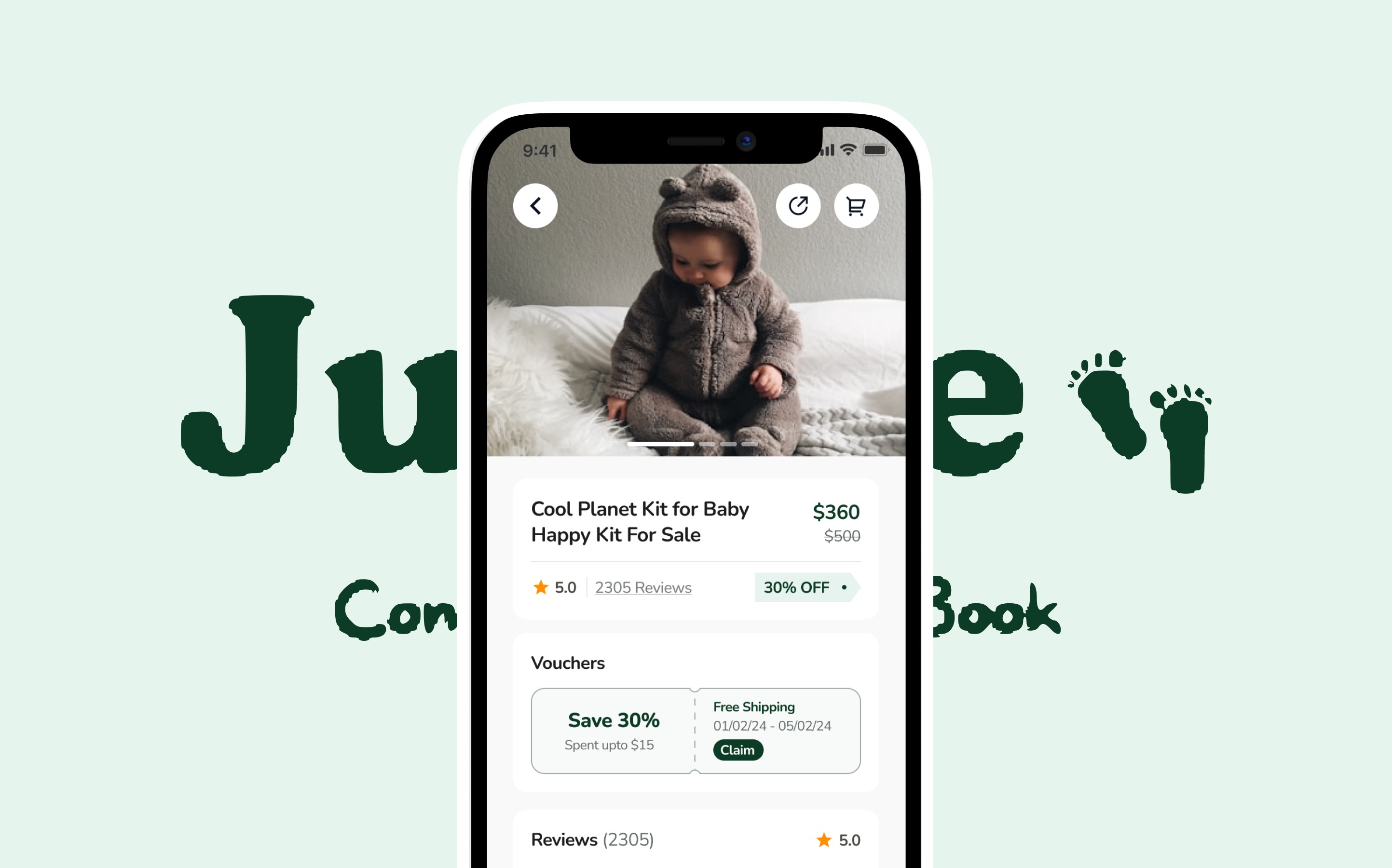
From early screen explorations to more resolved UI studies, the work centered on flow clarity, trust-building details, and making each step feel more intentional for both travellers and hosts.

Jungle process mockups
06 / FINAL UI

The final UI system combines a stronger travel atmosphere with clearer structure, helping the product feel both elevated and easy to use.

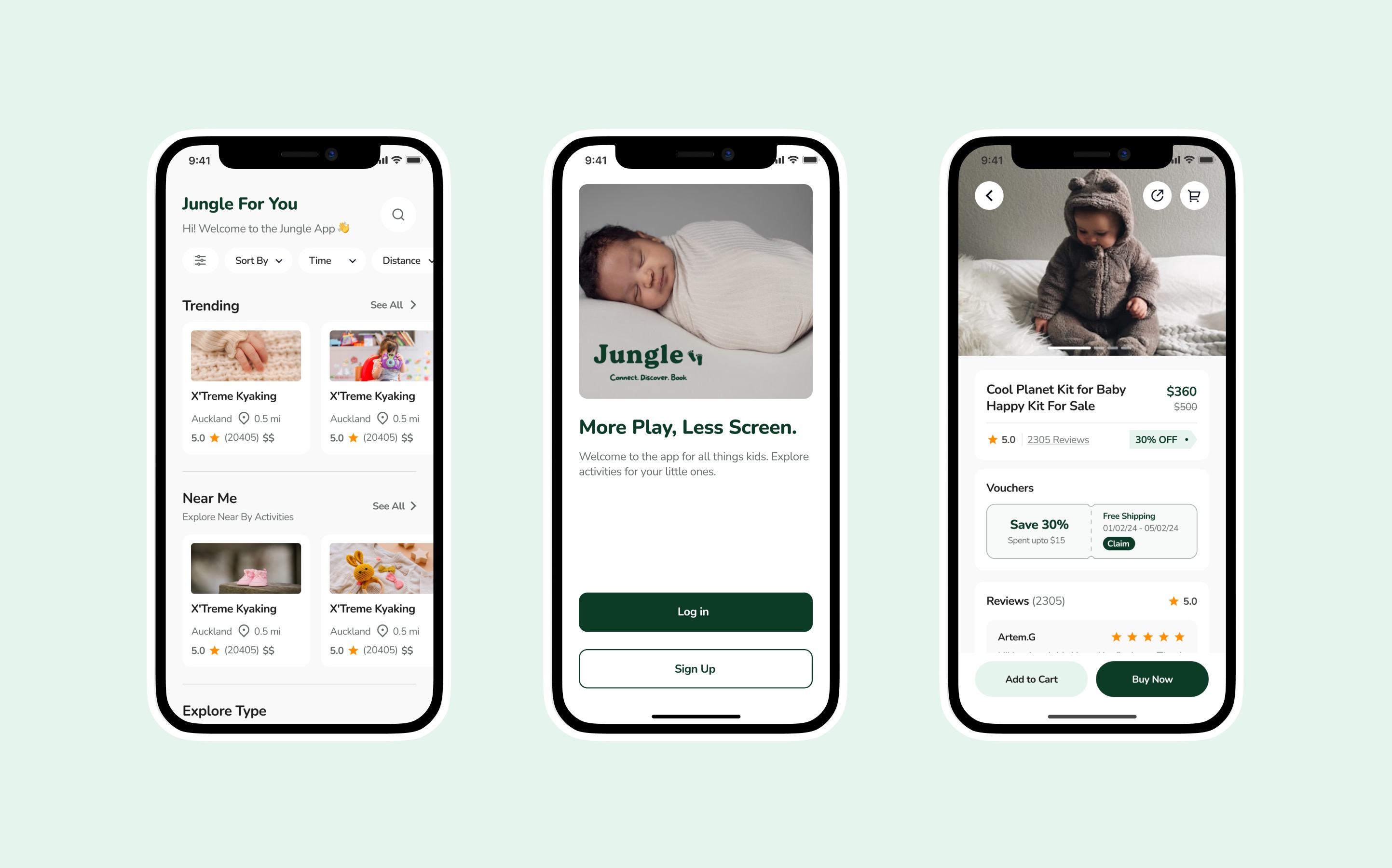
Visual hierarchy, large imagery, softened spacing, and more deliberate component behavior helped the final interface feel curated rather than crowded. The result is a marketplace experience with a stronger point of view and a better user journey.

Jungle final UI screen
07 / OUTCOME

Jungle evolved into a more cohesive travel product direction, with stronger emotional appeal, clearer booking logic, and a visual system that can scale across future product moments.

100+
Mobile screens refined across discovery, details, trust, and booking
1
Unified product language connecting brand atmosphere with usable mobile UX
← Back to Work