
Ewura Pay
A modern payment experience focused on trust, speed and everyday financial clarity.
Fintech / Payments
Mobile product
Product Designer
2025

Making digital payments feel immediate, familiar and secure.
Ewura Pay is shaped around everyday money movement. The interface prioritises clear balances, recognisable actions and straightforward transaction flows so users always understand what is happening.
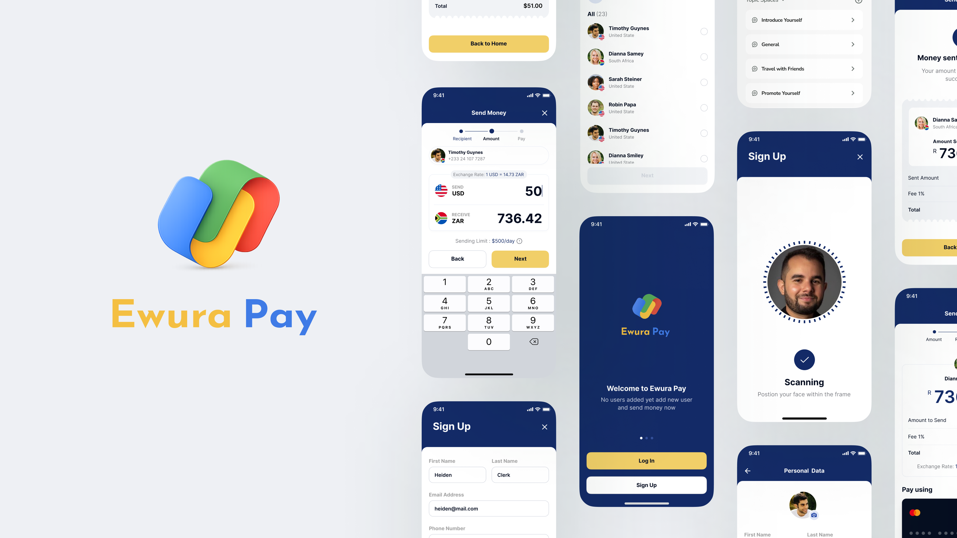
Build confidence into every transaction.
Financial products need to communicate status, risk and next steps without adding friction. The challenge was balancing simplicity with enough context for users to feel informed and in control.
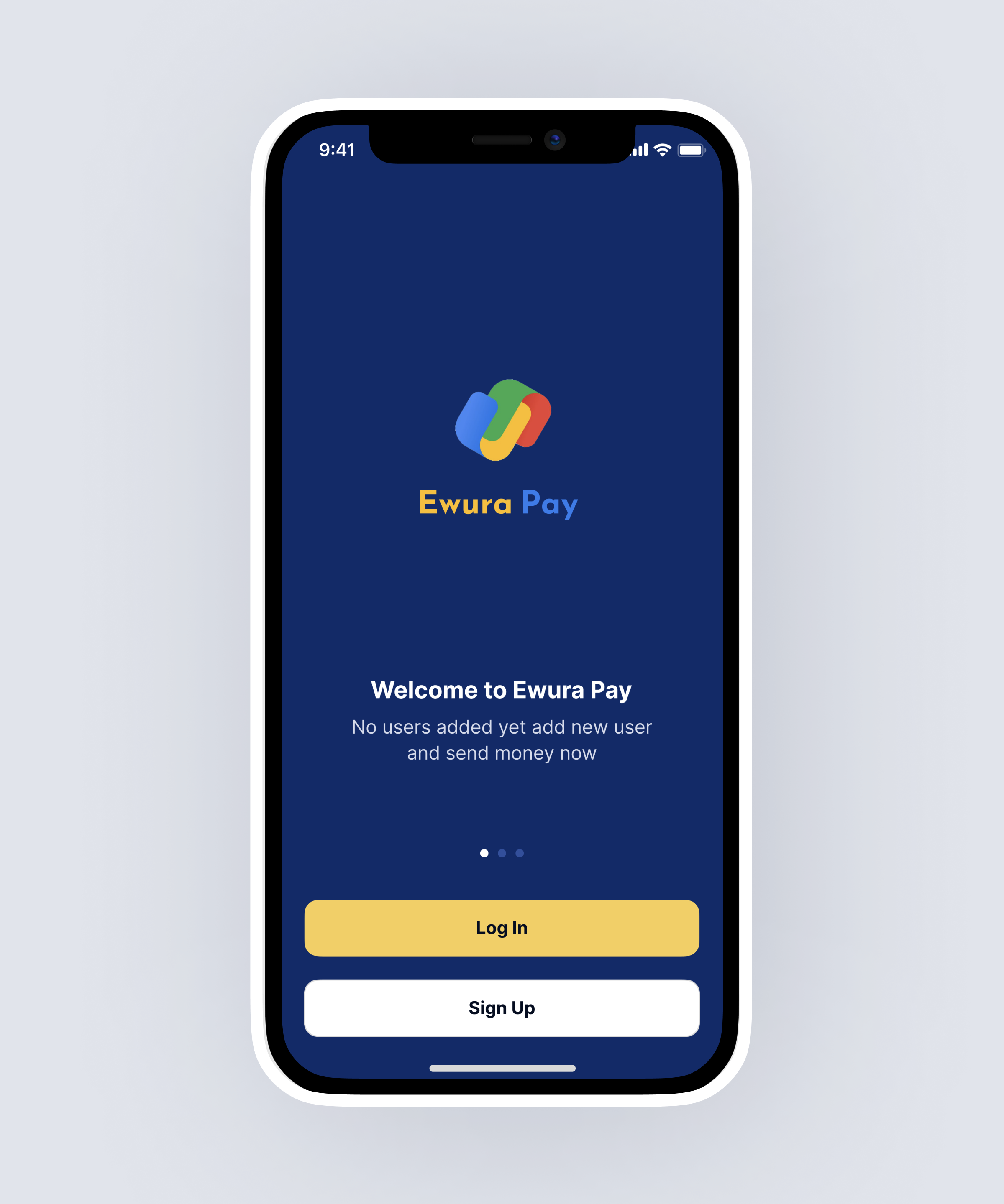
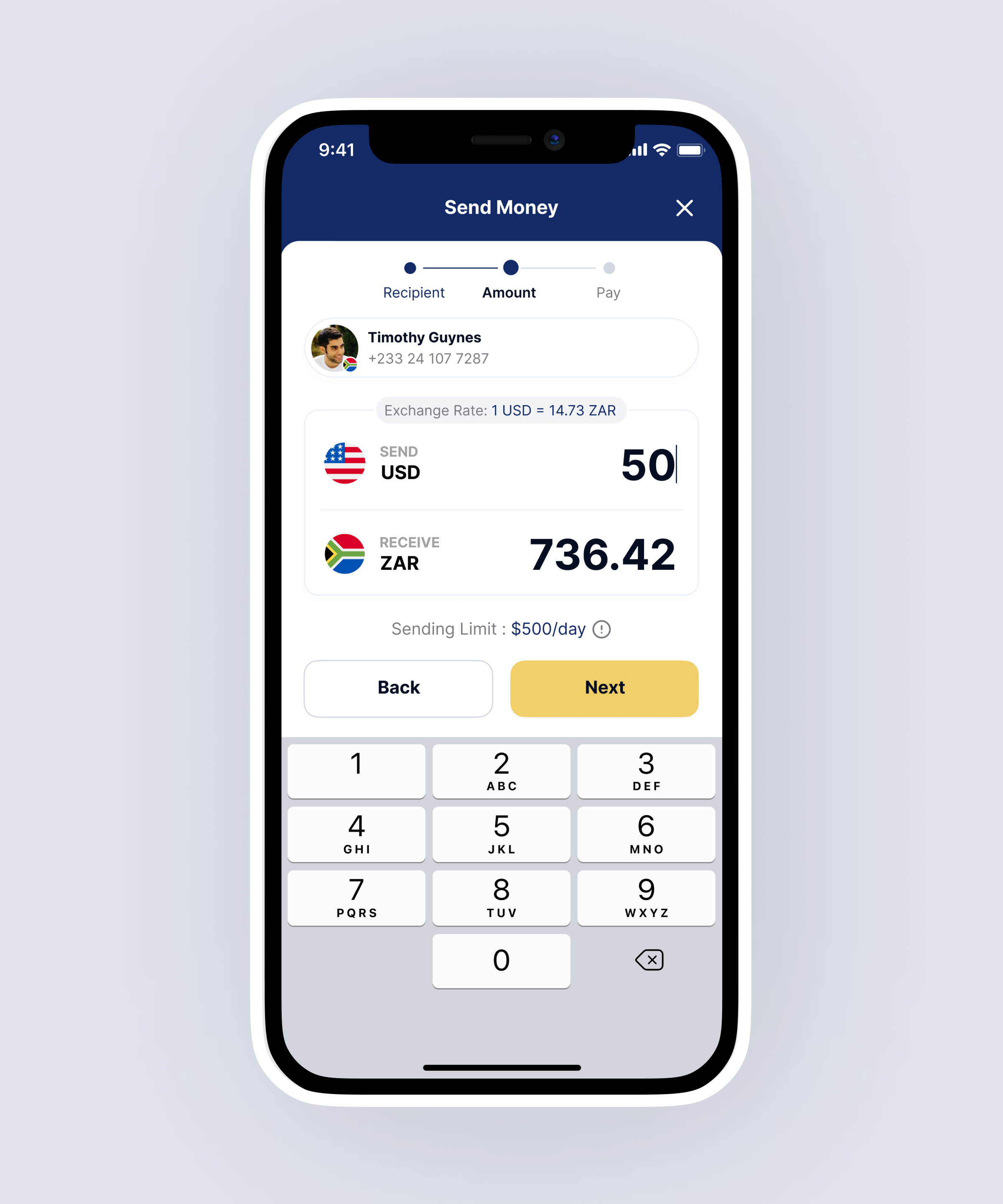
Clarity before
complexity.
Core journeys were simplified around the most common actions. Confirmation states, transaction feedback and predictable navigation patterns reduce uncertainty throughout the experience.
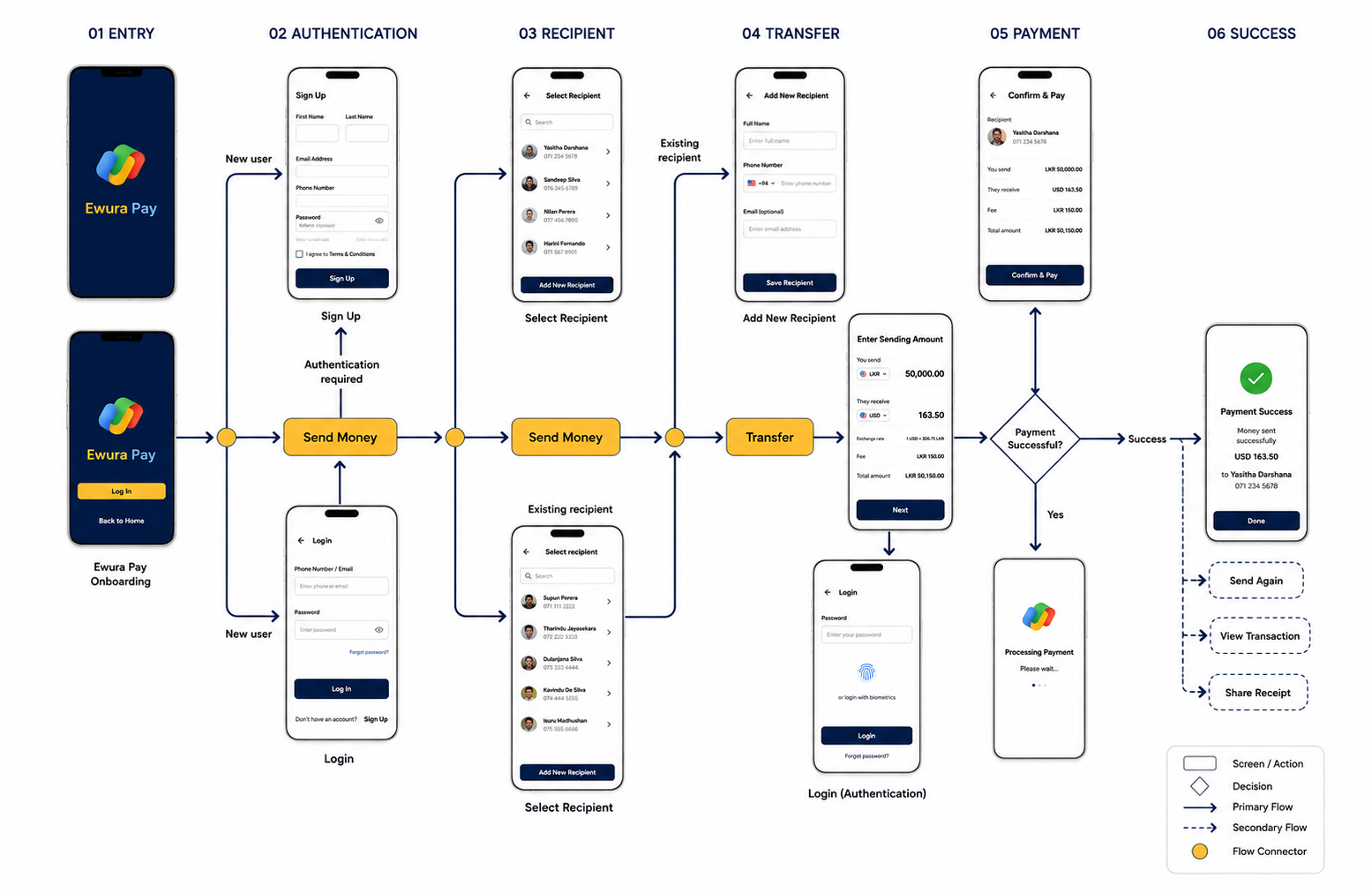
A consistent language for money and movement.
Reusable financial components, status patterns, typography and spacing create consistency across balances, transfers, activity and future payment features.
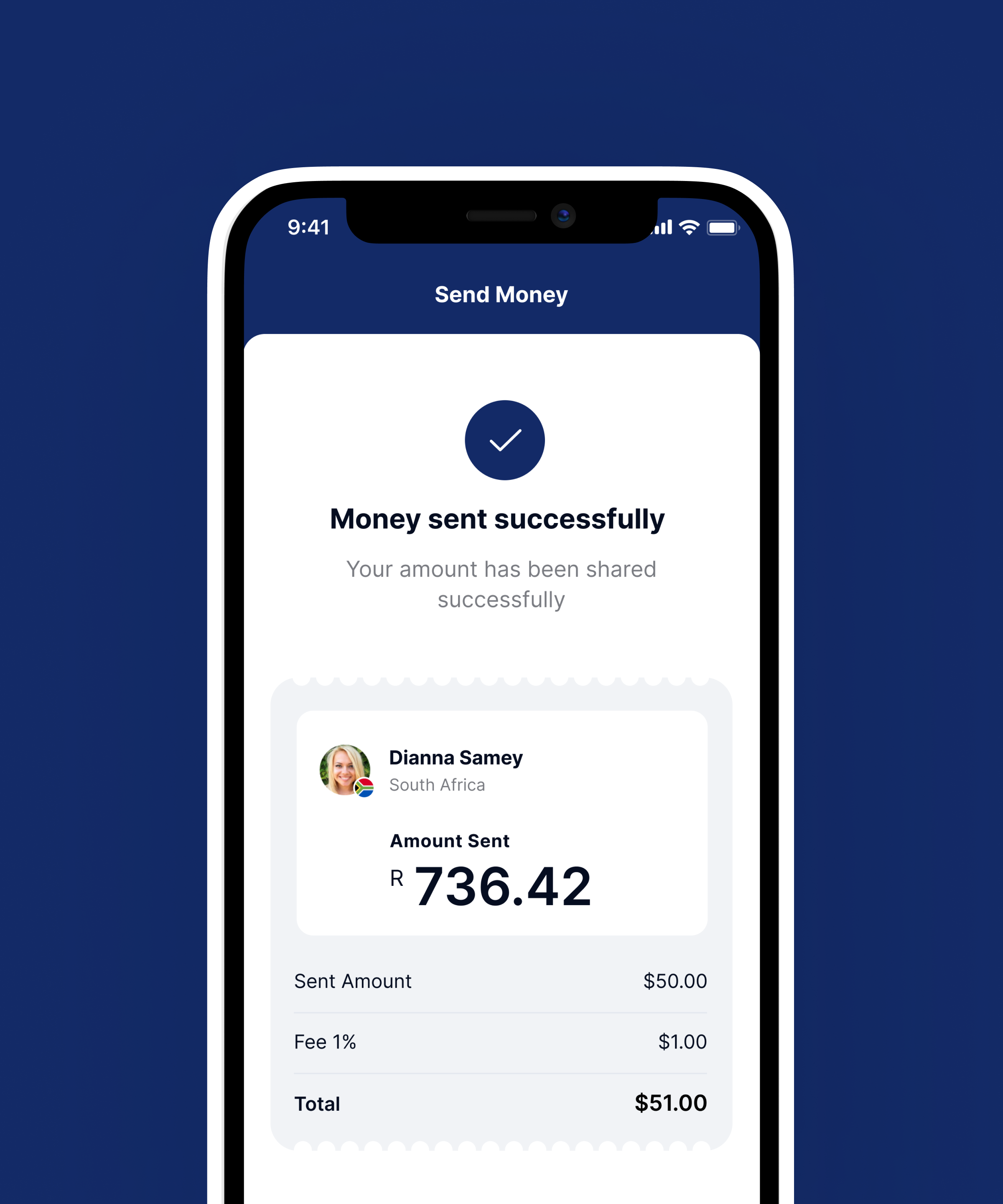

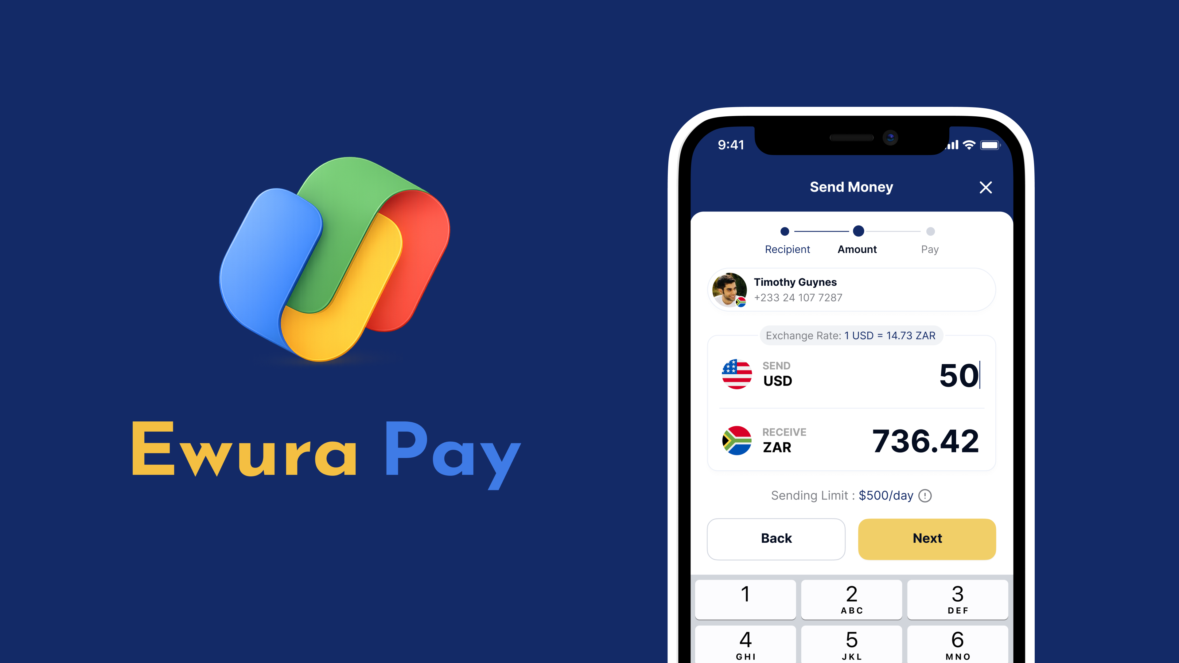
A payment experience designed around trust.
The final direction creates a cleaner, more coherent foundation for everyday payments while leaving room for the product to expand into a broader financial ecosystem.